How to Make a Readable Urdu Stylish Name That Still Looks Amazing
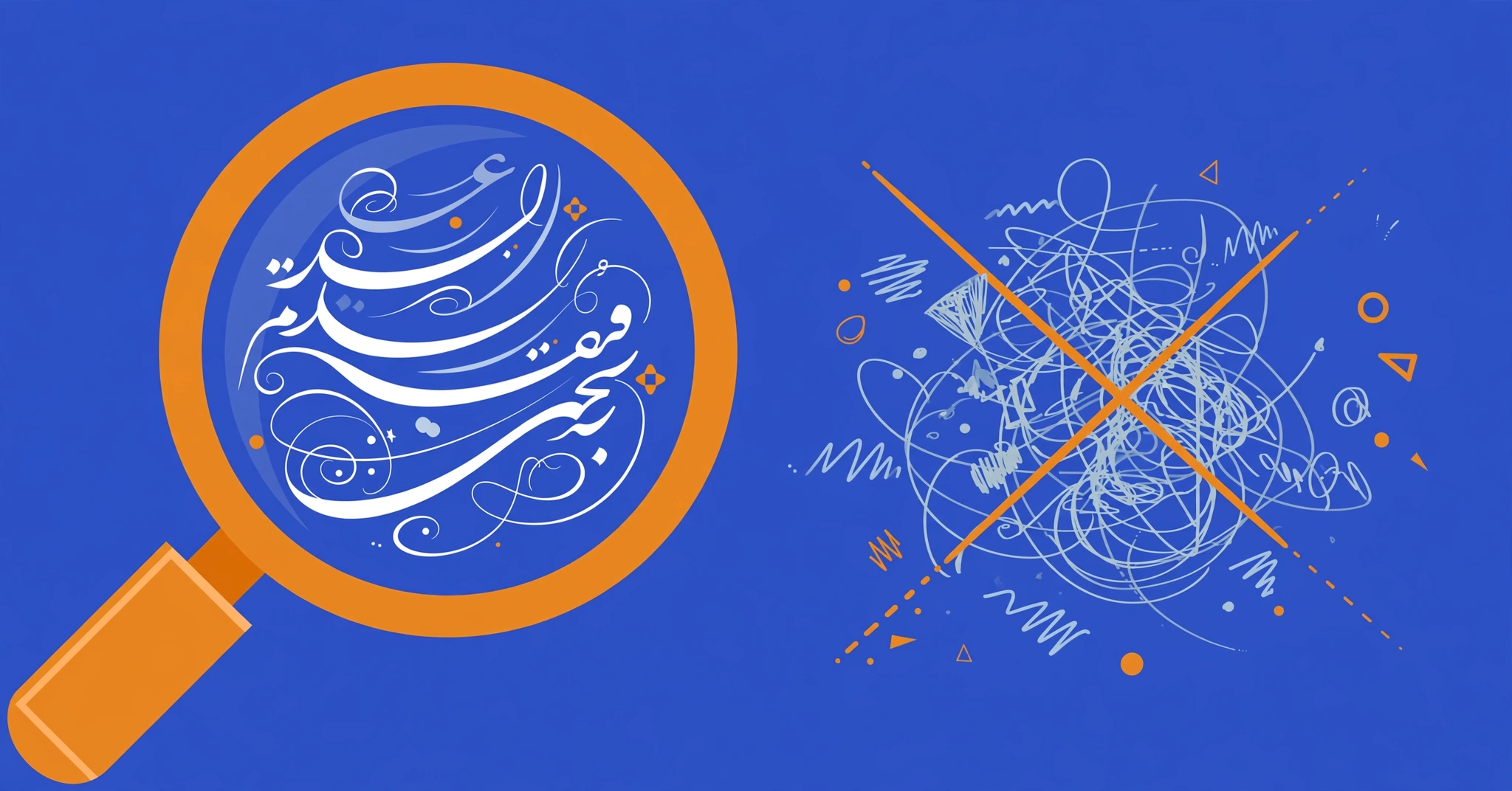
Style means nothing if nobody can read the name. A stylish Urdu name buried under five layers of symbols might impress in a generator preview, but in a WhatsApp chat list or a game lobby it becomes visual noise. People squint, give up, and remember you as “that person with the unreadable name”.
Readability is a design discipline, not a limitation. The clearest stylish names follow specific principles: protect letter joining, choose frames that frame rather than fight, limit decoration to one element, and test on small screens. This guide teaches those principles so every readable urdu stylish name you make looks sharp and reads instantly.
What Makes an Urdu Name Readable?
An Urdu name is readable when a stranger can identify every letter and read the full name in under two seconds. Three factors control this: correct letter joining, clear separation between name and decoration, and a total length the eye can scan.
Readability starts with the script itself. Urdu is cursive, so letters must connect properly. A name with broken joining forces the reader to decode each letter separately, which doubles reading time. Get the joining right and half the battle is won.
The second factor is visual hierarchy. The name should be the star and the decoration the frame. When symbols compete with letters for attention, the eye does not know where to look. One frame around the name creates a clear figure-and-background relationship. Five frames create chaos.
The third factor is length. Short names read faster. This is not just aesthetics. In chat lists, game lobbies, and comment sections, names appear in constrained spaces. A concise name survives every context. A sprawling one gets truncated or overwhelms.
How Does Letter Joining Affect Readability?
Urdu letters change shape depending on position, and the text engine handles this automatically only when letters sit adjacent. Anything inserted between letters breaks joining and destroys readability instantly.
The letter ع (ain) looks different alone, at a word start, in the middle, and at the end. Your phone renders the correct form based on neighbours. This shaping is invisible when it works and glaring when it fails. A name like ع★ل★ی shows three isolated forms instead of one flowing word. Native readers stumble. Non-readers see gibberish.
The rule is absolute. Never place anything between joined Urdu letters. No spaces, no symbols, no invisible characters. Decoration belongs outside the word: ★علی★ is correct, ع★ل★ی is broken. This single rule prevents the most common readability failure in stylish Urdu names.
Watch for invisible culprits too. Some copy sources insert zero-width characters that break joining without any visible sign. If a pasted name looks slightly wrong despite correct spelling, retype it manually or regenerate it in a clean tool. Our homepage generator produces joining-safe names by construction.
Which Frames Keep Names Clear?
The clearest frames are simple, symmetrical, and visually lighter than the name itself. Brackets, single star pairs, and thin geometric frames enhance readability. Heavy, asymmetric, or multi-layer frames harm it.
Not all decoration is equal. A frame should do two jobs: draw the eye to the name and stay out of its way. The Unicode character charts show which blocks each symbol comes from, which predicts how widely it renders. Here is how common frames compare for readability:
| Frame | Example | Readability | Notes |
|---|---|---|---|
| ★ ★ | ★علی★ | Excellent | Light, symmetrical, universally supported |
| ꧁ ꧂ | ꧁علی꧂ | Excellent | Distinctive brackets, clear boundaries |
| 『 』 | 『علی』 | Very good | Clean CJK brackets, slightly formal |
| ♛ ♛ | ♛علی♛ | Good | Bolder, suits attitude styles |
| 亗 亗 | 亗علی亗 | Good | Compact, modern feel |
| ╔ ╝ | ╔علی╝ | Fair | Box frames add visual weight |
| ꧁༒ ༒꧂ | ꧁༒علی༒꧂ | Fair | Double decoration, use sparingly |
The pattern: simpler wins. A single pair of matching symbols beats stacked combinations. If you are tempted to add a second frame, resist. One frame is style. Two frames is clutter. For the full technique behind frame placement, the guide to how to style urdu name covers the method in detail.
How Many Symbols Is Too Many?
One decorative element is ideal. Two is the maximum for most contexts. Three or more symbols around a short name overwhelm it and slow reading measurably.
Think of symbols as seasoning. A pinch enhances. A handful ruins the dish. Each symbol you add competes for the reader’s attention and eats character budget on platforms with limits. Free Fire allows 12 characters total including symbols as of October 2026, so every decorative character is a letter you cannot use.
There is also a rendering argument for restraint. Each additional symbol is another chance for a tofu box on someone’s phone. A name with one common frame has one risk point. A name with six exotic symbols has six. Minimal decoration is not just cleaner. It is statistically safer.
The practical test: cover the decoration with your thumb and read the name. Then uncover and read again. If the decorated version takes noticeably longer, you have too many symbols. A readable urdu stylish name should read at nearly the same speed with or without its frame.
Do Fancy Fonts Hurt Urdu Readability?
Fancy Latin fonts do not affect Urdu script readability because they replace the script entirely. But they destroy the name’s readability for Urdu readers, who must decode an unfamiliar font instead of reading their own script.
This is the script-versus-Latin decision. A name in real Urdu script (علی) is instantly readable to hundreds of millions of people. The same name in fancy Latin (𝓐𝓵𝓲) is readable only to those comfortable decoding decorative Latin, and it carries zero meaning for Urdu-only readers.
Fancy fonts also vary wildly in legibility. Bold mathematical letters (𝐀𝐥𝐢) read reasonably well. Script and fraktur variants (𝓐𝓵𝓲, 𝔄𝔩𝔦) are genuinely hard to parse at small sizes. If your audience includes anyone who reads Urdu, script is the readable choice every time.
The exception proves the rule. On platforms built for Latin text, like game clients, fancy Latin may be your only styling option. There, choose the clearest fancy variant and keep it short. Our comparison of Urdu script versus fancy Latin letters maps exactly when each wins.
How Do You Test Readability on a Small Screen?
Test readability the way your audience will experience it: on a phone, at arm’s length, in the actual app. A name that reads clearly on a desktop preview can fail completely in a chat list.
Most people design names on a large screen and deploy them on a small one. This is backwards. Your audience sees your name on phones, usually in lists, headers, or overlays where text is small. Design for the smallest context first.
A practical readability test takes thirty seconds. It also helps to know that system fonts like Google’s Noto project keep expanding coverage, so updating your phone improves rendering over time:
1. Set the name as your display name in the target app.
2. Open the context where others see it: a chat list, a lobby, a comment thread.
3. Hold the phone at arm’s length and glance at it the way a stranger would.
4. Time yourself reading it. Under two seconds is the pass mark.
5. Ask someone else to read it aloud. If they hesitate or misread, simplify.
The stranger test is the most revealing. You know what your name says, so you read it fluently. A stranger has no such advantage. If a friend reads your styled name without pausing, it passes. If they squint, it fails. A readable urdu stylish name survives strangers.
What Are the Clearest Styles for Each Platform?
WhatsApp favours plain names with light frames. Instagram rewards aesthetic balance. TikTok needs bold simplicity for video overlays. Games demand the shortest, clearest variants.
Each platform shows your name in a different visual context, and readability means adapting to it:
| Platform | Where the name appears | Clearest approach |
|---|---|---|
| Chat lists, headers | Light frame, real name prominent: ★احمد★ | |
| Profile header, search | Balanced frame, searchable: ꧁فاطمہ꧂ | |
| TikTok | Video overlays, comments | Bold and short: ♛زین♛ |
| Free Fire / PUBG | Lobbies, kill feeds | Minimal Latin or short Urdu: 亗علی亗 |
| Profile, search | Plain-first for findability: ★علی★ |
The common thread is restraint. Every platform rewards names that read instantly. Platform-specific collections like our WhatsApp names and VIP styles are built around these readability principles. For profile text beyond names, the fancy text keyboard keeps bios legible too.
Step-by-Step: Build a Clear Stylish Name
Building a readable stylish name takes five steps and about three minutes: spell correctly, choose one frame, place it outside the word, check the length, and test on a phone.
Follow this sequence for a readable urdu stylish name every time:
1. Write your name in plain Urdu script. Get the spelling exactly right first. Common correct forms: علی (Ali), فاطمہ (Fatima), احمد (Ahmed). No decoration yet.
2. Choose exactly one frame from the readability table above. For most purposes, ★ ★ or ꧁ ꧂ is the right choice.
3. Place the frame outside the word. The result should look like ★علی★, never ع★ل★ی. Verify every letter still joins naturally.
4. Count the total characters including symbols and spaces. Stay well inside your platform’s limit. Shorter is always safer.
5. Run the stranger test. Show it to someone who has not seen it before. Two-second read means done. Hesitation means simplify.
Ten minutes the first time, two minutes once the sequence becomes habit. Or skip the manual work entirely: generate a readable name in one tap with our free tool, which applies these principles automatically. The beginner’s guide covers the foundations if you want to understand the why behind each step.
Frequently Asked Questions
What is a readable urdu stylish name? A readable urdu stylish name is an Urdu name with decorative styling that a stranger can still read in under two seconds. It keeps correct letter joining, uses one simple frame placed outside the word, and avoids symbol overload. Style should frame the name, never fight it.
Why do stylish Urdu names become hard to read? Three causes cover nearly every case: broken letter joining from symbols placed inside the word, too many decorative elements competing for attention, and rare symbols that render as boxes on some phones. Fix the joining first, then reduce decoration, then swap rare symbols for common ones. Our guide to fixing box-rendering in Urdu names covers symbol safety in depth.
Is Urdu script or fancy Latin more readable? For Urdu readers, Urdu script is far more readable. It is their native script, read fluently. Fancy Latin forces decoding of an unfamiliar decorative font. For international or gaming audiences who do not read Urdu, clear fancy Latin may communicate better. Match the script to the reader.
How many symbols should a readable name have? One decorative element is ideal. Two is the maximum for most contexts. Each symbol adds visual noise and rendering risk. If covering the decoration makes the name dramatically easier to read, you have too many symbols.
Do frames like ꧁ ꧂ hurt readability? No, when used correctly. ꧁ ꧂ is one of the clearest frames available: symmetrical, visually light, and clearly separated from the name. Problems come from stacking frames (꧁༒ ༒꧂) or placing decoration inside the word, not from the brackets themselves.
Why does my name look fine to me but unreadable to others? You know what your name says, so your brain fills in gaps automatically. Strangers lack that advantage. Always test with someone seeing the name for the first time. The stranger test reveals readability problems that self-review misses.
Are bold Unicode letters readable? Mathematical bold (𝐀𝐥𝐢) reads reasonably well at normal sizes. Script (𝓐𝓵𝓲) and fraktur (𝔄𝔩𝔦) variants are significantly harder, especially on small screens. For maximum readability in Latin styling, prefer bold or standard decorative variants over the fanciest ones.
Should readability matter for gaming names? Absolutely. In fast game lobbies and kill feeds, opponents and teammates read names in fractions of a second. An unreadable name is forgettable, and forgettable names never build reputation. Short, clear names get remembered. Cluttered ones get ignored. For game-ready options built inside character limits, browse the gaming names hub.
Can a name be both stylish and readable? Yes, and the best ones are. ★علی★ is both stylish and instantly readable. Style and readability conflict only when decoration overwhelms the name. One good frame enhances. Five frames destroy. The discipline is knowing when to stop.
Where can I generate readable stylish names automatically? Our free homepage generator builds joining-safe, readable Urdu names in one tap with no signup. For curated starting points, the boys and girls tool sorts ideas by style. More deep dives live on our blog hub.


One Comment